
Mapbox recently introduced a new feature that allows you to visualise external data directly within Mapbox Studio using different types of visualization:
- Choropleth map
- Data-driven circles
- Data-driven lines
- 3D extrusions
This blog post walks through the steps to create the below visualization entirely within Mapbox Studio of Airbnb locations in central London using data-driven circles. Each circle represents one listing, all of which are coloured based on their price band.

Add the Visualization Component
The feature is accessed via the Components panel in Mapbox Studio. Starting with a Monochrome map, click the Add Component button and then select the Data visualization component:

Load Your Data
The next step is to load the data you want to visualise into Mapbox Studio. The following types of data can be used:
- MBTiles
- KML
- GPX
- GeoJSON
- Shapefile (zipped)
- CSV
- GeoTIFF (to create raster tiles)
For this example, I’m using a CSV file of Airbnb listings which you can find here if you want to follow along. (I’m using the “listings.csv” file for London).
Click the Upload data link:

In the popup window that appears, drag and drop the listings.csv file into the area shown below:
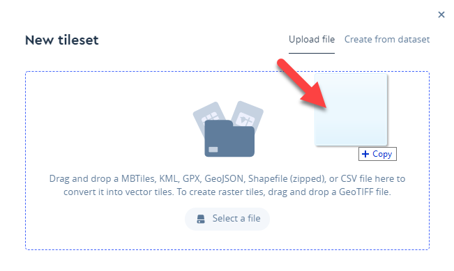
Then click Confirm:

Mapbox will then begin to upload the file. Once complete, you’ll see a confirmation in the lower-right corner of your screen:

Select Your Data
With the data uploaded, we now want to select it in our list of data sources on the Your sources tab in the Data visualization component:

Select the Visualization Type
With the data selected, click the button at the bottom of the Data visualization panel to select the type of data visualization to use:
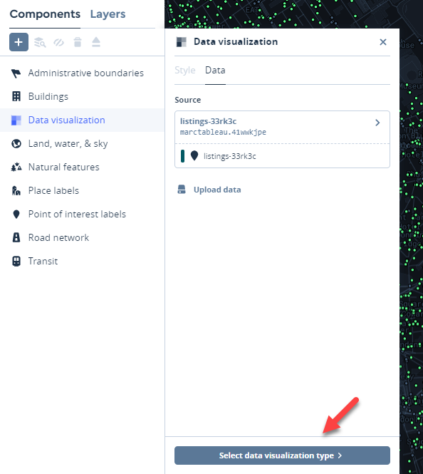
We’re using Data-driven circles for this visualization:

Add Colour Encoding
We can now format the way our data is encoded, such as the colour, size, borders etc. of the circles. I want to colour the circles based on the price of each listing. To do this, click the Style tab in the Data-driven circles component and then click the field selector next to the Colour label. This will show a pop out window with a list of fields in your data. Select the price field:

Currently, the colour ranges from pink to blue. To make it clearer for the viewer to see the different price bands, I’m going to add more colours to the palette and then switch to using a stepped (or bucketed) palette, which we’ll get to shortly.
To add more colours, click the + Add stop button. I’ll add two additional stops to make a total of five and then assign a price value to each stop by typing in a value – this determines the relationship between colour and a price bucket:

Let’s also change the colour palette used. To do this, on the main left-side panel, click Colors and select Temperate (or your palette of choice) from the drop-down list:

Back on the Style tab of the Data-driven circles component, click the Data type drop-down and select Bucketed. This changes the way the circles are coloured from a smooth gradient to using ascending buckets:

Using a stepped colour palette in this way makes it easier to differentiate the listings by price bracket.
Other Options
On the same panel there’s also options to:
- Add data driven labels
- Size the circles based on a data field or manually using the slider
- Add a Stroke (a circle border)
- Adjust the opacity
Current View with Light Background
Here’s a more zoomed out version of the map with the current settings.

At this zoom level the circles are a bit large, so I’ll adjust the size using the slider on the data visualisation panel. I’m also curious what it would look like with a dark background.
Change the Map Base Colour
To change the background (or base) colour, click the Colours tab on the main left-hand panel, then click the Base colour swatch and select a dark grey:

I had previously published the map, so I can now click publish again to preview the most recent change to the base colour. The dark background is more effective with the Airbnb circles standing out more clearly, so I’ll click Publish once more to save these changes:

And that’s it! We now have a map of all the Airbnb listings in London colour coded by price bracket:

The data visualisation component is a great addition to Mapbox. If you haven’t used Mapbox before, I’d definitely recommend taking a look. I have a getting started blog post on using Mapbox here.
I hope this was useful and thanks for reading!
Marc Reid
Be notified of new content…
If you find these Tableau tips and tutorials useful, you can follow me on LinkedIn for all the latest content.
Thanks,
Marc
Learn Tableau and other data & AI skills via the link below.

Note: The link above is an affiliate link, which means I may earn a small commission if you decide to sign up — at no extra cost to you. It helps support the running of this site.

“Bel article très instructif! Aymeric Inpong”