
In the upcoming 2020.4 release, Tableau is introducing the Map Layers feature. This allows you to overlay multiple marks layers on a map with no hard limit to the number of layers that can be used.
Dual Axis Maps
It was previously possible to add two layers to a map using the dual axis technique as shown in the following example. The three images show:
- A simple map created showing State with the Map mark type
- The Latitude pill duplicated to create a new marks card and City added as a Circle mark type
- The two pills are combined using a dual axis to overlay the City Circle marks on top of the State Map marks


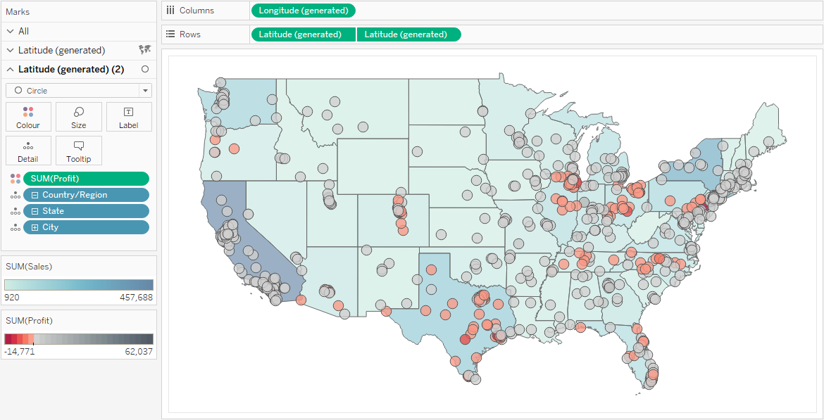
See this Tableau help page for more information on dual axis maps.
The limitation with this technique is that you can only have 2 layers. Map Layers removes that limitation and also make the process easier and more intuitive as there is no dual axis required. Let’s take a look.
Map Layers Example
In this first example I’ll create three map layers using Tableau’s Superstore data:
- Layer 1 for State using a Map mark type
- Layer 2 for City using a Shape mark type
- Layer 3 for Postcode using a Circle mark type
Layer 1 – State
The first layer is created in the same way as before Map Layers. Simply double click on the State field for it to appear in the view and a map is automatically created. Change the mark type to Map and add the Sales measure to colour:

Layer 2 – City
When adding layers to an existing map, the new Map Layers functionality comes into play. Start to drag the City field on to the view to show the new Add a Marks Layer drop zone:

Continue to drag the City field on top of the Add a Marks Layer drop zone. The drop zone turns orange:

At this point release the mouse button to add City as a new layer to the map. Change the mark type to Shape and select a diamond from the Shape shelf. Add the Quantity measure to the Size shelf and adjust the size and transparency per the image below:

Finally, drag Postcode into the view and onto the add marks layer drop zone:

Change the mark type to Circle and add the Profit measure to Colour. Format with a diverging, stepped colour palette with just two colours to highlight whether profits are positive (blue) or negative (pink):
The map now shows three layers, each at a different level of granularity, showing three separate measures using different encodings:

Map Layers UI Options
For each layer added to a map a corresponding marks card is created, so the spatial element on each layer can be encoded using a different mark type and formatting if desired (as per the previous example).

Toggle Visibility
A really useful feature is that you can switch the visibility of any map layer on or off simply by clicking the eye icon to the left of it’s name:

Clicking the eye turns the visibility off and the icon is updated to show a line through it.

Rename Layers
By default, each map layer is given the name of the field added to the view. But these names can be changed by double clicking the layer name and typing a new one:

Other Map Layer Options
Each map layer has a context menu with the following options:

| Disable Selection | Disables marks being selected on this layer, which is useful for customising the user experience, for example, to allow only cities to be selected and not states. |
| Add to Zoom Extent | When ticked, ensures the marks on this layer will be visible when the maps zoom level is not pinned |
| Move Up | Moves this map layer up the stack of layers |
| Move Down | Moves the layer down |
| Rename | To rename the layer |
| Hide | The same as clicking on the eye icon to hide the layer |
| Remove | Deletes this layer (and associated marks) from the view |
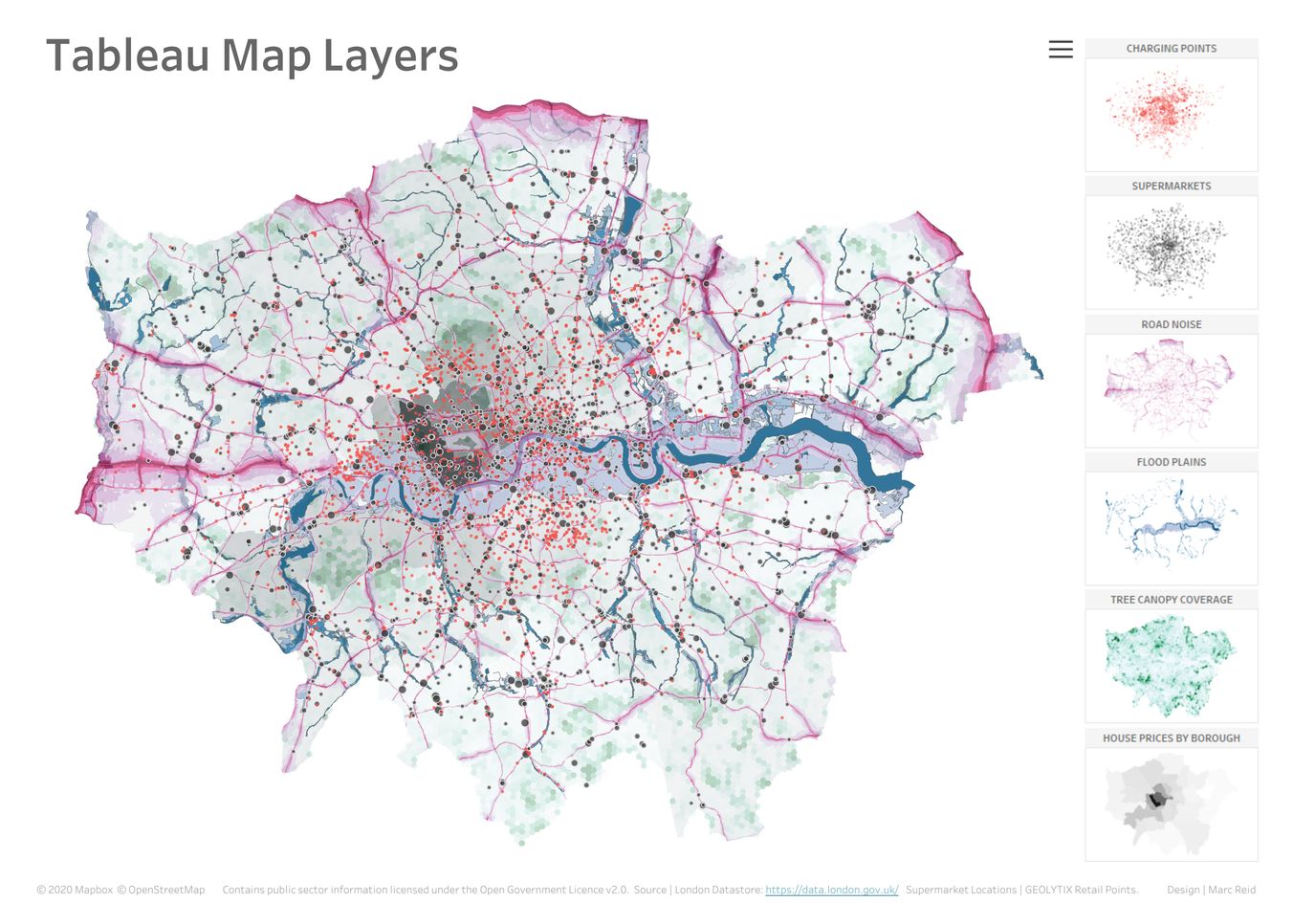
A Mix of Spatial Data
This next example includes a mix of spatial files and point locations that, together, create a view of London that could enable someone to make a more informed decision about, for example, where to buy a house.
The six layers included are:
- Median house price per borough
- Tree canopy coverage
- Flood plains
- Road noise levels
- Supermarket locations
- Car charging point locations
Here they are individually (swipe/tap to see the next image)


Joining Spatial Data Files
For this first release of Map Layers it’s necessary to join or relate all the sources of spatial data you want to use in the map layers for a given worksheet, as I’ve done below:

(Note, full outer joins were used for the spatial files where required to ensure all data was included. You can learn more about joining data in Tableau here).
In a future release, it will be possible to build maps by layering multiple data sources in the same worksheet without joins.
Layering the Spatial Files
Below are the same six map layers being layered one on top of the other in Tableau, showing a zoomed-in section of the city for clarity:


The corresponding 6 Marks cards for each of these layers is shown below with the layers renamed for clarity:

Final View
The final view, below, shows the full map with a side panel identifying the six map layers. Legends for each of the layers can be seen by clicking the ‘hamburger’ button. Click the image below to open an interactive and downloadable version on Tableau Public.
Conclusion
Map Layers opens up new possibilities for working with a range of spatial data and I can see it being particularly useful where you have many separate files with point locations that you want to plot on the same map. For example, in the above use case, I could have gone on to add the locations of various other points of interest – coffee shops, schools, car parks etc., whichever locations would be useful to see to support decision making.
Removing the need to wrangle all these separate data sources into one file to enable all points to be mapped makes the process a lot easier. Creating a separate Marks card for each layer also allows for more control and flexibility with the visual appearance.
Update for version 2021.4
A quick addition to this post to say that v2021.4 has now been released which enables map layers with multiple data sources. You can learn more about this in the following video tutorial:
Be notified of new content…
If you find these Tableau tips and tutorials useful, you can follow me on LinkedIn for all the latest content.
Thanks,
Marc
The recent release of Tableau 2024.1 includes an update to spatial buffers and you can now create these buffers around line string objects.
Click here to learn more…

