CJ Mayes joined the Tableau community earlier this year and has made quite a splash with his stylish sports visualisations. It’s impressive how CJ has developed his technical and design skills so quickly and it’s great that he’s taken the time to build on the work of Spencer and Luke to create this template. Over to CJ to walk you through his process…
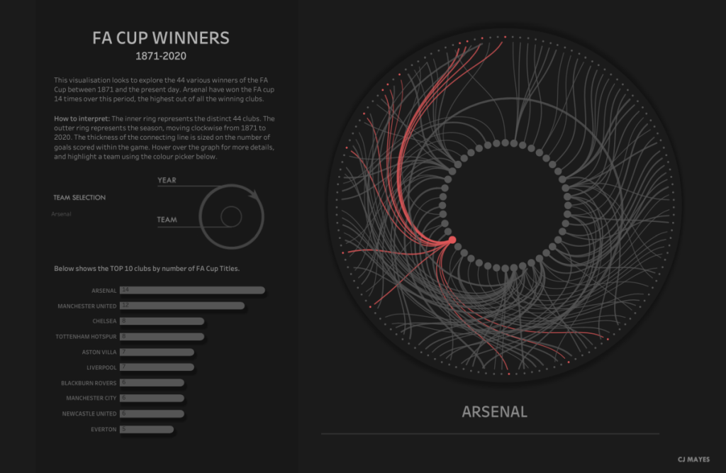
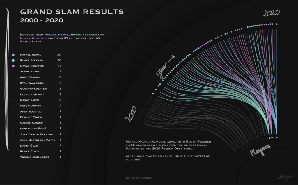
Recently I’ve been playing around with a lot of radial graph concepts and am delighted to share a template to create your own circular Sankey. A couple of examples from my portfolio include looking at the FA Cup Winning Teams, as well as Grand Slam Winners between 2000 and 2019, as shown below.
It would be senseless not to start my post in admiration of Sam Parson’s beautiful Viz for Social Good that was posted during the time of putting this blog together. His Viz for Social Good piece explores using a multi-level circular Sankey, as well as an additional bar chart plotted at the end, all packaged in one sheet. Both technically and aesthetically fantastic!
Credits
Having a keen interest in sports, I Initially stumbled across Spencer Baucke’s UEFA circular Sankey. The foundations of this template were hugely formed off his tutorial, which can be found here. It appears Luke Stanke was at the origination of the circular Sankey, with a post at the start of 2019, you can find out how he constructed his piece based on superstore data here. A huge thank you goes to them both for their insights.
Template
The aim of this tutorial is to have a template that makes the construction of the graph as easy as possible as I’m sure we can all admit the calculations and maths gets a little overwhelming at times. I’ll be replicating the build of the visualisation found here – but by all means replace the dataset with your own as we go along. You can access both of these on a shared drive here:
Lets start by jumping into the dataset!
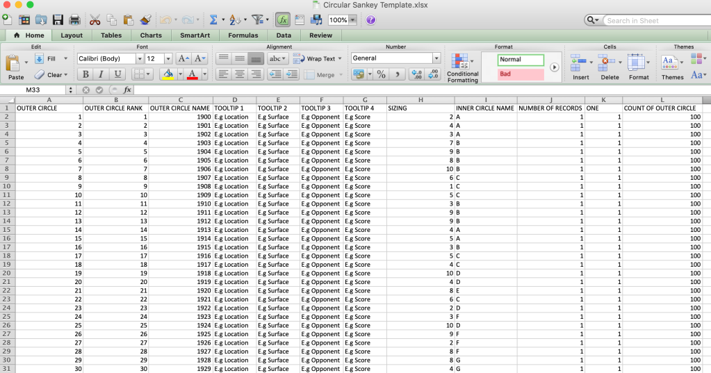
You’ll find three tabs in the excel document.
- DATA – The main dataset.
- INNER CIRCLE RANK – a datasheet we will be left joining to our initial data.
- JOIN – a datasheet we will be left joining into to our data used for data densification (i.e. The curvy lines!)
Lets take these one by one to explain how it will work.
Data Tab
| Column Name | Description |
| Outer Circle Name | This is the name for what you would like the outer ring / E.g. end point be called. For example, in my template datasheet this is referring to the year. |
| Outer Circle Rank | A rank given to each year – each year is a DISTINCT point; the template includes 100 years of history. More on this below. |
| Tooltip 1/2/3/4 | You can populate these three tooltips with any information you like. |
| Sizing | You can populate this with either your sizing for the chord lines, or the inner/outer circles. |
| Inner Circle Name | This is the name for what you would like the inner ring / e.g. start point be called. For example, in my template datasheet this is referring to random letters currently. |
| Number of records | 1 |
| One | This is needed for the data densification – make sure this is populated for every row in your dataset. |
| Count of Outer Circle | This is a count of the distinct outer circle name/rank. As each record is a different year the count is 100, as there are 100 years. |
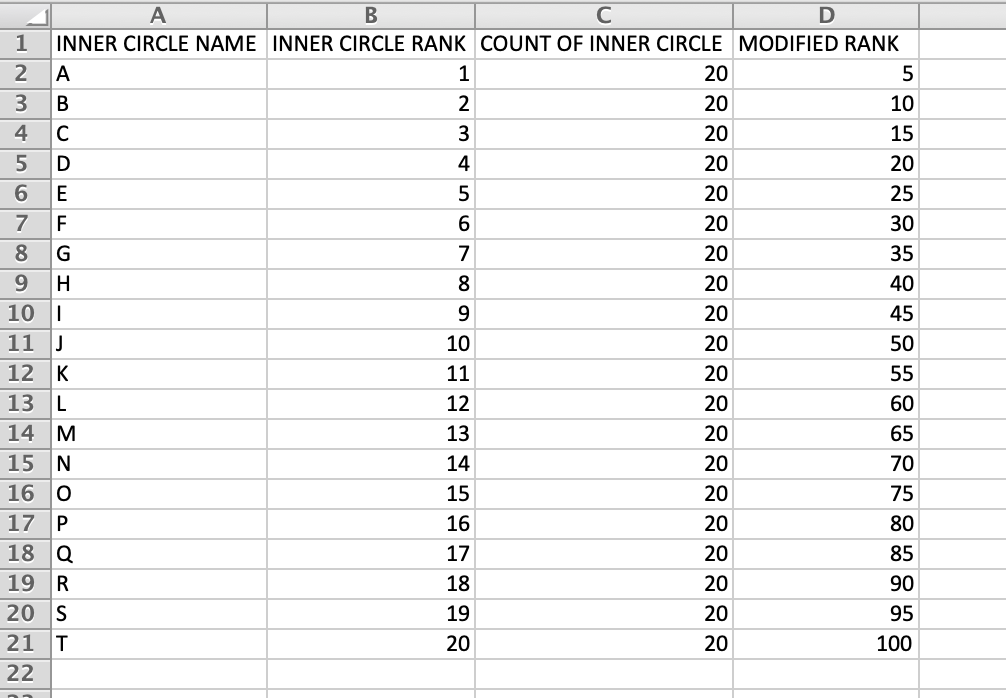
Inner Circle Rank Tab
| Column Name | Description |
| Inner Circle Name | This is the name for what you would like the inner ring / e.g. start point be called. For example, in my template datasheet this is referring to random letters currently. Note: This name gets matched into our main dataset using a left join so must have the same alias. |
| Inner Circle Rank | A rank given to each of your inner circle dimensions – More on this below. |
| Count of Inner Circle | A DISTINCT count of the dimensions in the inner circle, for example the template refers to 20 different letters, within the 100 records. |
| Modified Rank | Modified rank is used within the workbook to get the correct spacing of the dots. This calculation is done by doing the inner circle rank / count of inner circle * the distinct outer circle rank. |
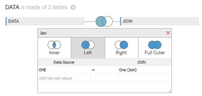
Join Tab
| Column Name | Description |
| One | This is the left join required for the data densification, joining to ‘One’ in the data tab. |
| T | T is used to refer to the chord, start and end nodes. T between 0 and 1 is the chord. T=2 and T=3 will refer to the circles of the start and end points. |
Things to be cautious of during Data Prep, ranking, joins and excel calculations:
Data Preparation
STEP 1 – Outer Circle Rank
The OUTER CIRCLE RANK moves (+1) clockwise. For our dataset, each outer circle dot represents a year. Therefore the first dot is number 1 (equivalent of the year 1900) working clockwise round to dot 2, (equivalent of the year 1901) etc, and so on up until the 100th dot.
The easiest way to create your OUTER CIRCLE RANK is to order your dataset from earliest event to most recent event (ascending order) and then add in a number next to it increasing from 1.

STEP 2 – Distinct Count of Dimension Values
As these dots are distinct years we know that the count of outer circle is 100 (i.e the number of rows.) So we populate the full column COUNT OF OUTER CIRCLE with 100.
STEP 3 – Inner Circle Ranking
The INNER CIRCLE RANK moves (+1) clockwise. For our dataset, each outer circle dot is represented by a letter of the alphabet (A through to the letter T). Therefore the letter ‘A’ represents the first dot working clockwise round to the dot represented by letter ‘T’. As our data set is a many-one relationship we will join this data in separately.
So what’s the easiest way to create the rank for the inner circle? The easiest method to do this is to first, sort the data on the DATA worksheet in ascending order on the OUTER CIRCLE NAME (E.g year) field.
Now copy Column H (the INNER CIRCLE NAME column) and paste it into column A of the INNER CIRCLE RANK worksheet, then use the excel function to remove duplicates. Leave the de-duped data in the same order, as this will create your rank from the most recent, to the latest record.

This has created your inner circle rank values for each corresponding inner circle dimension name.
STEP 4 – Count of Inner Circle and Modified Rank Fields
Then we need to populate the COUNT OF INNER CIRCLE and MODIFIED RANK. COUNT OF INNER CIRCLE is referring to how many distinct ‘INNER CIRCLE NAMES’ there are. In the template dataset there are 20.
MODIFIED RANK is then calculated by doing INNER CIRCLE RANK / COUNT OF INNER CIRCLE * COUNT OF OUTER CIRCLE.
In this case this is a number between (1 and 20) divided by 20, times by 100. Your last modified rank number should be equal to the count of outer circle rank (e.g. 100 = 100).
STEP 5 – Tooltips and Sizing
Populate any further details in the tool tip columns within the data sheet. Also add in any sizing columns you’d like the chords or circles to have. Make sure to leave columns ‘ONE’ and ‘NUMBER OF RECORDS’.
Leave the Join tab as it is, but as a brief explanation: A T value between 0 and 1 is for the data densification and then we use T=2 and T=3 as separators for the inner and outer circles respectively.
This should now be all the data prep we need.
The Workbook
If you’ve kept the same column headers as in the excel template you should be able to refresh the data source within the workbook, but here’s how to build it from scratch:
STEP 1 – Connect to the Data Source
Connect to the Excel file: “Circular Sankey Template”
First, drag the DATA sheet onto the canvas. We will then want to left join the “Join” Table on ONE = ONE.
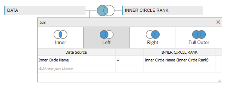
We also want to left join the Inner “Circle Rank” on INNER CIRCLE NAME = INNER CIRCLE NAME:
STEP 2 – Calculations
Open a new sheet and create the following calculations. Again, credit to Spencer Baucke for these calculations:
t (logodds)
IF [T] > 0 AND [T] < 1 THEN LOG([T]/(1-[T])) END
Distance
IF [T] <= 1 THEN 2.5 -((1/(1 + exp([t (logodds)] )))) * 2.5
ELSEIF [T] = 2 THEN .21
ELSEIF [T] = 3 THEN 2.3
END
Path
IF [T] <= 1 THEN
((([Outer Circle Rank]-[Modified Rank])*[T])+[Modified Rank])/{COUNTD([Outer Circle Rank])}
ELSEIF [T] = 2 THEN
[Inner Circle Rank]/{COUNTD([Inner Circle Name])}
ELSEIF [T] = 3 THEN
[Outer Circle Rank]/{COUNTD([Outer Circle Name])}
END
X
([Distance] + 1) * COS([Path] * 2 * pi())
Y
([Distance] +1) * sin([Path] * 2 * pi())
Separator
IF [T] <= 1 THEN “chord” ELSEIF [T] = 2 THEN “start point” ELSEIF [T] = 3 THEN “end point” END
X-Shape
IF [T]=2 or [T]=3 then [X] ELSE NULL END
X-Lines
IF [T]=2 or [T]=3 then NULL ELSE [X] END
Inner Circle Colour
[Inner Circle Name (Inner Circle Rank)]
Tool Tip For Circle
IF [T]=2 THEN [Inner Circle Name] ELSE STR ([OUTER CIRCLE RANK]) END
(Note, the Outer Circle has been cast as a string to fit the if statement)
STEP 3 – Build the View
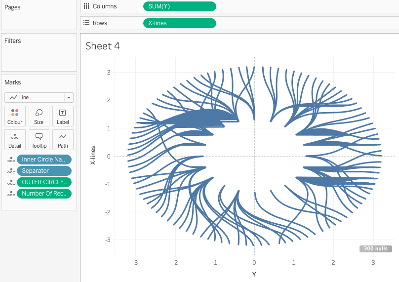
- Drag Y onto Columns
- Change the marks card to line.
- Drag Inner Circle Name from the data table onto Detail
- Drag Separator onto Detail
- Drag Outer Circle Rank (as a dimension) onto Detail
- Drag Number of Records (as a dimension) onto Detail
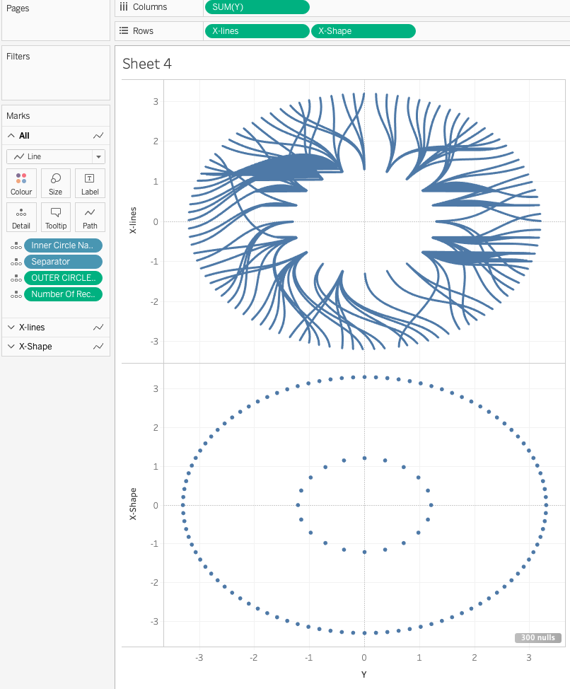
- Drag X-Lines onto Rows as a dimension
You should now have a view like this:
- Drag X-Shape onto Rows as a dimension to create circles for the start and end locations:
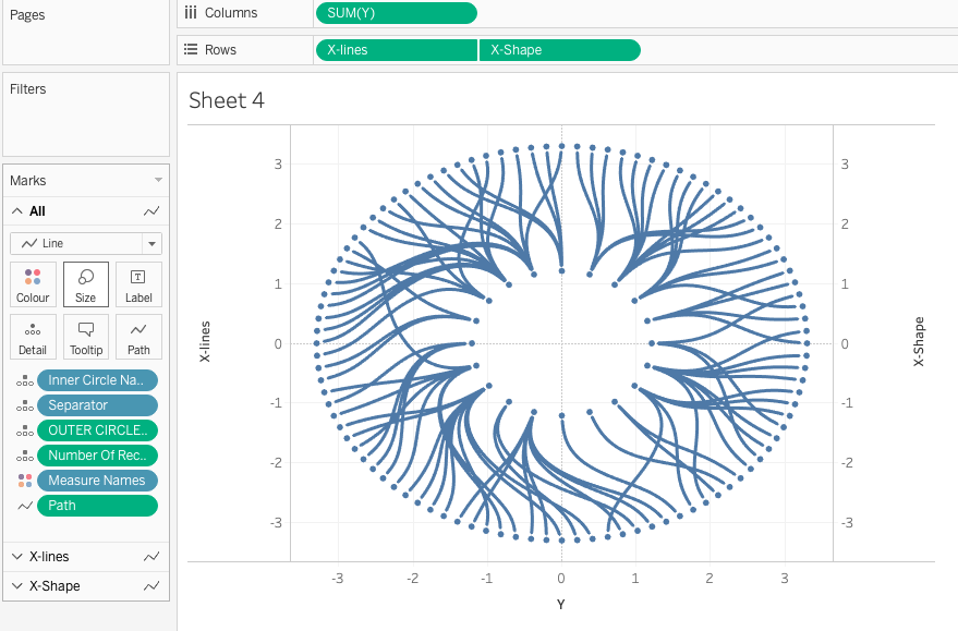
- Drag Path onto path.
- Dual axis the two charts and Synchronise the axes to create one chart:
STEP 4 – Formatting
- Drag the Inner Circle Colour calculation onto the Colour shelf for all marks cards.
- Go to the X-Lines Marks card, drag the Sizing field onto the Size shelf and make it a Dimension. Adjust accordingly.
- Change the mark type of the X-Shape Marks card to a Circle.
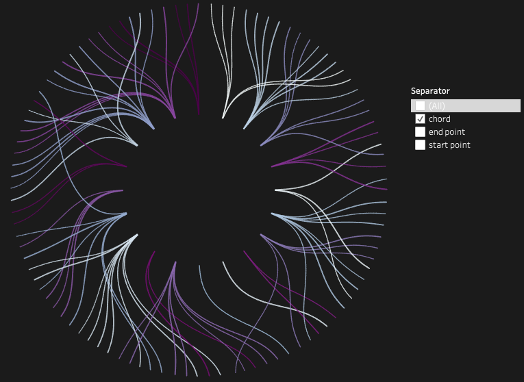
- Format out some of the background lines, and hide the axis.
- Add and remove tooltips as you desire, see the below example
- Why not try a near-black background too? … They’re much cooler.
STEP 5 – Tooltips
Drag the Tool Tip For Circle calculation on to the Tooltips shelf of the X-Shape Circle marks card.
How does the tool tipping work?
Anything between 0 and 1 of T is the chord, T=2 is the inner circle dots and T=3 is the outer circle dots. You can see how this works by playing around with the Separator filter.
And that’s a wrap!
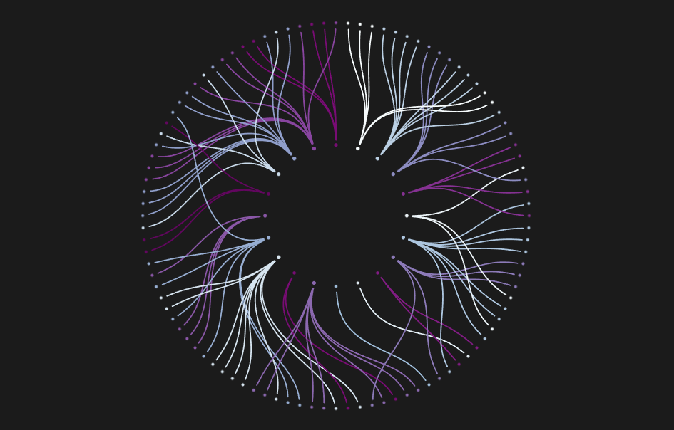
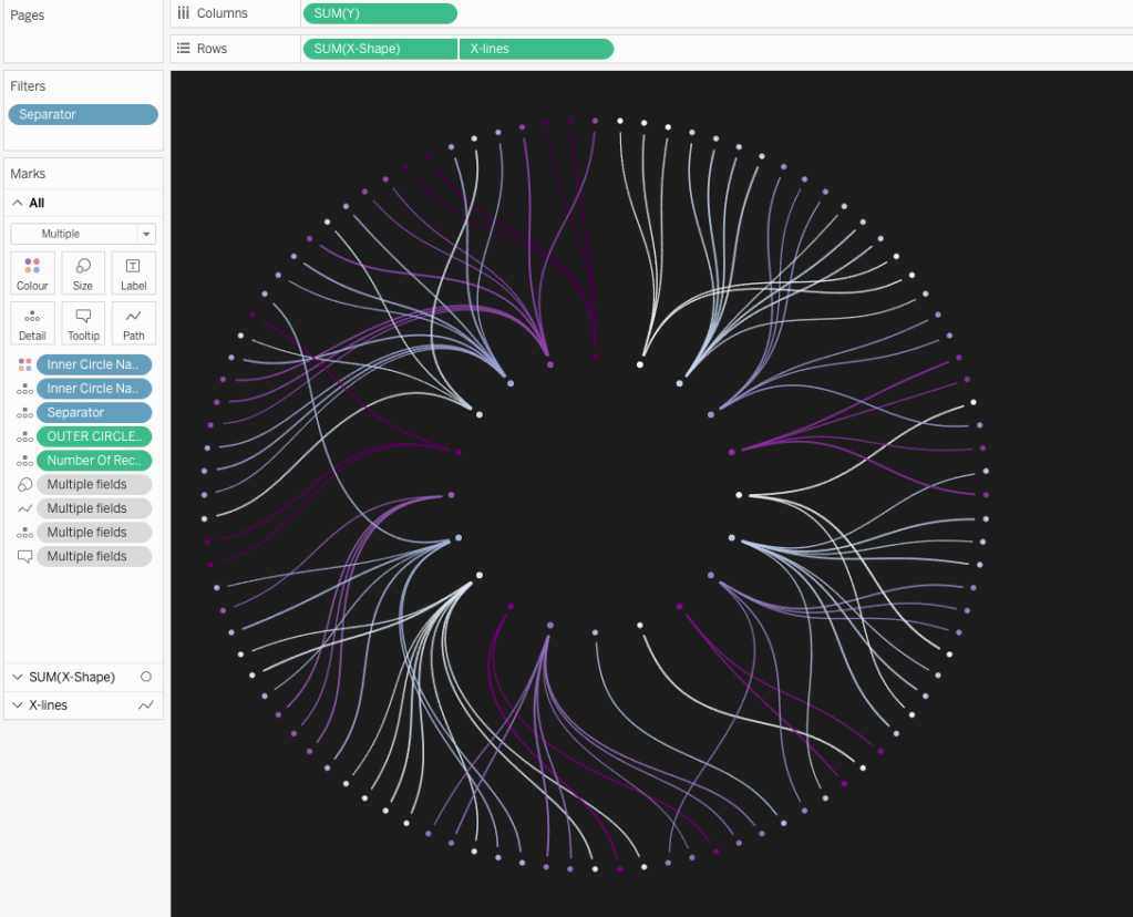
Here’s what the finished article should somewhat look like.
Hopefully you’ve managed to replicate the diagram, or even managed to get it to work for your own dataset. Super excited to see what you come up with. Do tag me in your creations and reach out if you have any questions. I can be found on Twitter or Linkedin.
Be notified of new content…
If you find these Tableau tips and tutorials useful, you can follow me on LinkedIn for all the latest content.
Thanks,
Marc
The recent release of Tableau 2024.1 includes an update to spatial buffers and you can now create these buffers around line string objects.
Click here to learn more…


Leave a comment